Event Ticket Design: QR Tickets That Work on Phones and in Print
Event ticket design guide: drag-and-drop blocks, phone preview, ticket-page privacy controls, and getting print colors right with CMYK.
The Ticket Is Your First Brand Touchpoint
Long before the stage lights come on, your guests have already held your brand in their hands — on the ticket. It sits in their inbox for weeks, gets pulled out on the train, is shown to friends over coffee. A sloppy ticket with clashing colors and a tiny QR code tells a story about your event that no amount of stage design can undo. Event ticket design is where your event makes its first impression.
And yet ticket design trips up organizers in two predictable places: the design looks different on every phone, and the printed version comes back from the vendor with colors that match nothing you approved. Both are solvable — if you understand the two worlds a ticket lives in.
Build the Design: Blocks, Not Pixels
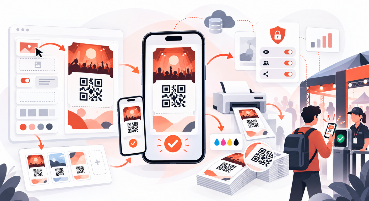
A good ticket editor works like building blocks, not Photoshop. You compose the ticket from ready-made block types — guest name, tier, seat or table number, event info, the QR code, images, decorative shapes — positioned on a fixed canvas. No free-form drawing means no accidental “the QR ended up behind a logo” disasters.
Two rules worth following regardless of tool:
- The QR code owns its real estate. Nothing overlaps it, nothing tints it. A QR that scans on the first try, in dim lobby lighting, through a cracked screen protector, is the single most important element on the ticket.
- Preview on a phone before you ship. The ticket that looks generous on your 27-inch monitor gets viewed at wallet size. Editors with a phone preview show you what guests actually see — cramped fields reveal themselves instantly.
Once the design exists, you assign it to a ticket tier — VIP gets the gold treatment, staff gets the utilitarian one — and one design becomes the default for anything unassigned.
Control What Guests See on the Ticket Page
Beside the designed ticket, every guest receives a ticket link — the page they open on their phone at the door. This page deserves the same scrutiny as the ticket itself, because it is what the scanner actually faces.
The ticket-page controls are organized as a master toggle plus per-section switches:
- Show ticket details — the master switch. Turn it off and guests get a minimal, QR-only view: name, email, phone, custom fields, companions, guide images are redacted server-side — the data never even reaches the guest’s browser. For privacy-sensitive events (executive dinners, closed-door briefings), this is the mode you want.
- Per-section switches — event info, guide images, guest details, companions, ticket actions. Each hidden section is enforced at the server, not merely hidden in the browser.
Two behaviors guests will run into: once a ticket is scanned, the QR is covered by a “Used” state — but the guest can tap Show QR to reveal it again so door staff can double-check, while cancelled and expired tickets stay covered. And on walk-in companion events, the guest’s name carries a +N party badge, so a family of four doesn’t look like a data glitch.
Print Colors: RGB vs CMYK, Without the Heartache
Screens display in RGB (red, green, blue light). Printing presses lay down CMYK ink (cyan, magenta, yellow, black). The same hex code can look vivid on a phone and disappointingly dull on paper — the classic “the vendor ruined our colors” dispute is usually nobody’s fault, just two different color worlds.
If your print vendor’s brand guide specifies CMYK values, design in CMYK from the start:
- Switch the template’s color model to CMYK; color inputs become C / M / Y / K channel fields (0–100) instead of hex pickers.
- The editor warns you when a color is out of gamut — impossible to reproduce faithfully in the other model — so you find out before the vendor does.
- The screen preview resolves the closest sRGB approximation for display, while the server-side PNG rendering reads your original CMYK values — so the printed ticket matches what your vendor asked for, not what your monitor guessed.
The practical workflow: get the CMYK values from whoever owns the brand guide, enter them once in the template, and stop eyeballing colors on screen. The numbers are the contract; the preview is just a courtesy.
A Pre-Flight Checklist
Before sending tickets to 3,000 guests:
- Scan-test the QR on two different phones, in bad lighting, at an angle.
- Read the ticket at phone size — every field legible, nothing truncated.
- Check the ticket page settings — is anything visible that shouldn’t be? Default to hiding more than you think you need.
- Print one proof if tickets go to print — in the color model the vendor asked for.
- Assign designs to every tier — an unassigned tier falling back to the default is usually fine, but “usually” is not a pre-flight answer.
Conclusion
A ticket has two lives — glowing on a phone and inked on paper — and a good design system serves both: block-based layouts that can’t break, phone previews that show reality, ticket-page controls that protect guest privacy at the server, and CMYK support that keeps your print vendor honest to your brand. QRS ships a drag-and-drop ticket editor with phone preview, server-enforced ticket-page privacy controls, and native CMYK print colors.
Found this helpful?
Explore more articles on this topic